Client Work
Examples of work I have done from high-fidelity designs to audits. All work has been created using Figma.
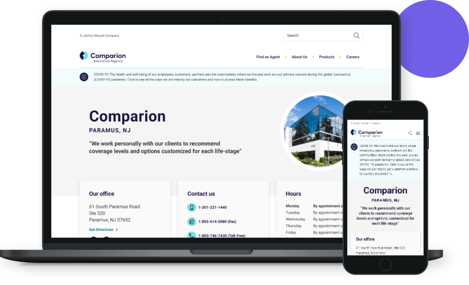
Comparion
Insurance companies often wanted custom agent pages to communicate to the user the specialties of the different agents. Comparion also requested a custom directory to filter by insurance type such as pet insurance and life insurance, along with a basic directory for locations.
View Designs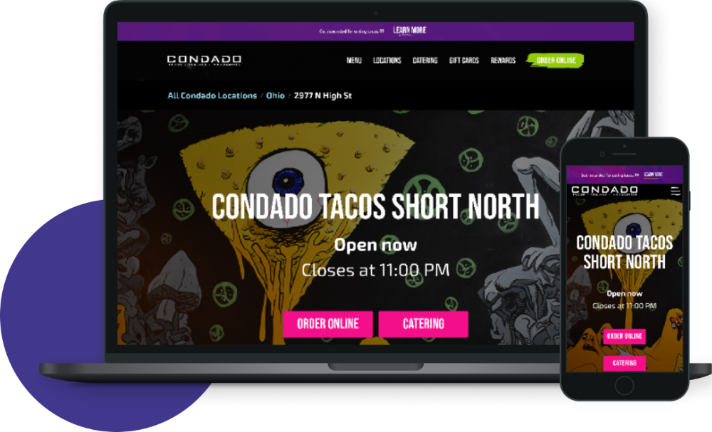
Condado Tacos
A Taco chain the emphasizes their unique art style and feel. They wanted their designs to highlight the different artists that contribute to the different locations.
They also requested designs for locations that are coming soon and a custom review form to allow customers to leave feedback for the different locations.
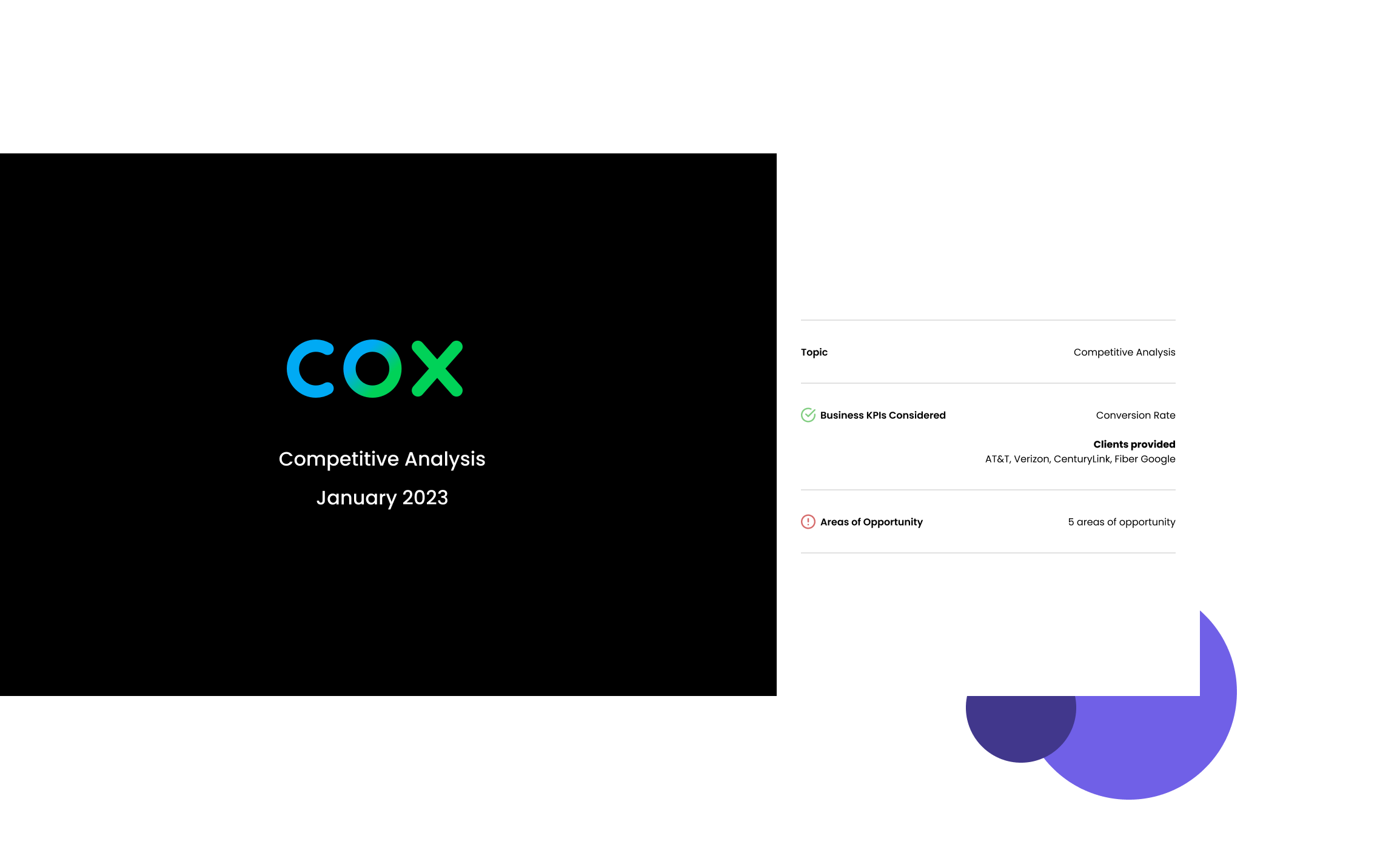
Cox Competitive Analysis
Cox wanted an analysis done to help identify areas that could be improved to help increase the rate of change. By comparing CenturyLink, Verizon, AT&T, Google Fiber I was able to note certain features that Cox could implement to help improve the rate of change.
View Analysis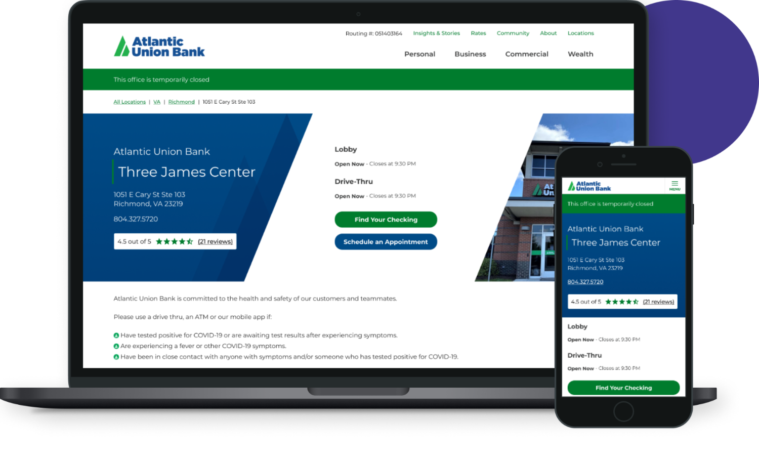
Atlantic Union Bank
Many financial institutions use custom location pages. Atlantic Union Bank was one of those clients, but they had some tricky buttons. I took this challenge upon myself to implement them into the designs. See how the buttons align with their live site here.
View Designs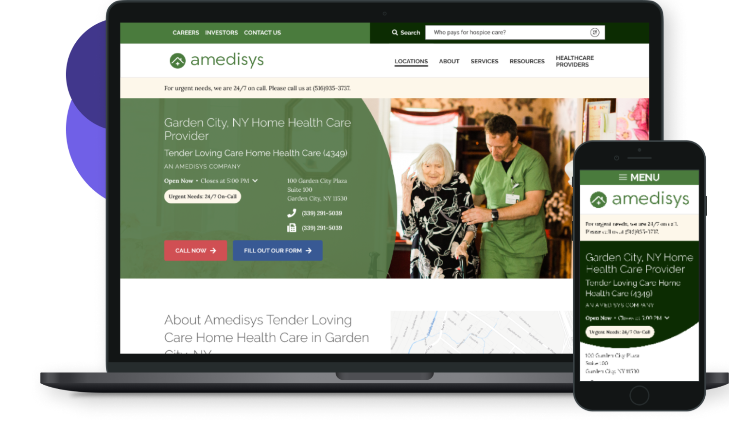
Amedysis
Amedysis had a lot of content that they wanted above the fold, readily available to the user without scrolling. To solve this request, some information was initially collapsed and other information was readily available when the page loaded. Also, a design pattern that I was able to incorporate that is seen on their main site is the green circle overlaying the image. By bringing in design patterns that the client uses on their main site, the designs appear unified with their main branding.
View Designs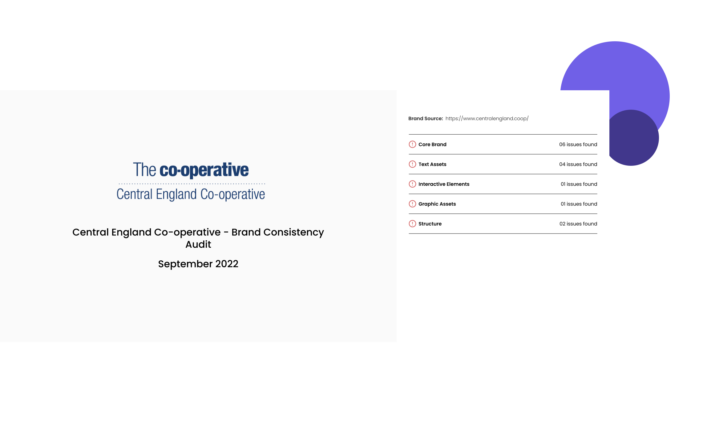
Central England Co-Op Brand Audit
Central England Co-Op wanted an audit to identify areas of inconsistency in their designs. By doing so, they were able to decide what areas needed improvements.
View Audit